Creating a map chart with markers
In a map chart with markers, data associated with locations is represented by markers placed in a geographical context.
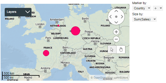
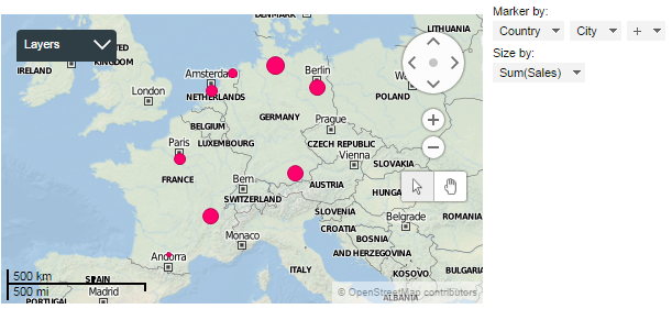
The map chart consists of different layers, where the background map forms one layer, and markers representing the actual data form another layer. Navigation controls for zooming and panning are located to the right in the visualization.
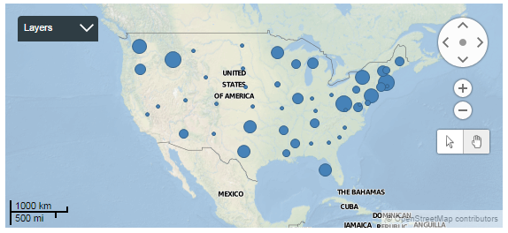
The markers for geographical names in your data are automatically positioned on their geographic coordinates on the map. The sizes of the markers reflect values from a certain column in your data, usually a numerical column containing, for example, sales figures. The values may represent aggregated data or not aggregated data for the particular location. Aggregated values could be, for example, sums or averages.
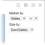
The main axes in the map chart with markers are the
Marker axis and the
Size axis in the legend.
Procedure
-
In the toolbar, click
Add new visualization,
 , and select
Map Chart (Markers).
A suggestion of a map chart with markers is presented.
, and select
Map Chart (Markers).
A suggestion of a map chart with markers is presented.
Example
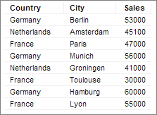
Markers reflecting the sum of sales per city are automatically positioned on the map.
To let each marker reflect the total sum of sales per country, simply remove City from the
Marker axis. The markers get a central position in each country, and their sizes update to reflect the total sum of sales per country.