Visualizing data involves presenting aggregated values of the data you have loaded. In most cases, the data to aggregate is numerical, but also non-numerical data can be aggregated. Examples of aggregated values are sums, averages, counts of occurrences, or results from various statistical calculations.
Note: Some visualizations, like the table visualization, do not support aggregation of values, and sometimes values can be aggregated only on certain axes.
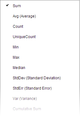
You specify which aggregation to display on an axis in the axis' column selector,

.
Examples of aggregations
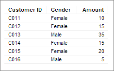
To illustrate some aggregations, this simple data table is used.
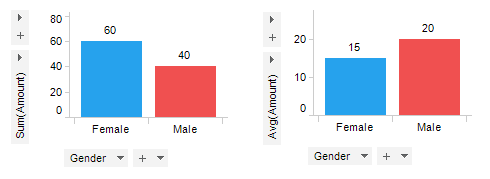
First, data in the numerical column, Amount, is aggregated using Sum and Avg (average), respectively.
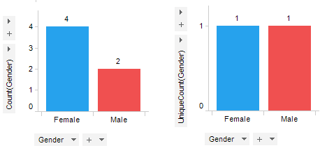
Second, data in the non-numerical column Gender is aggregated using Count and UniqueCount, respectively.