Creating a map chart with colored regions
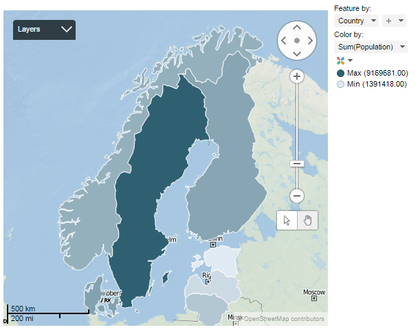
In a map chart with colored regions, colors represent data associated with geographical regions. The regions, also called features, can be for example countries, provinces or postal code areas. The entire shape of a region is colored, and it is automatically placed in its geographical context.
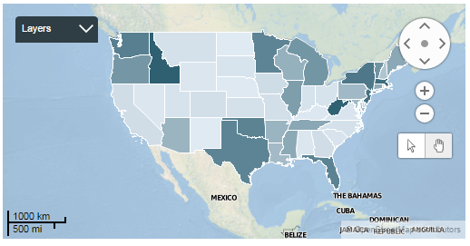
The map chart consists of layers, where the background map forms one layer, and the colored regions (or features) representing the actual data form another layer. Navigation controls for zooming and panning are located to the right in the visualization.
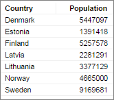
The geographical regions in your data are automatically positioned on top of the background map. Their colors reflect values from a certain data column, usually a numerical column containing, for example, sales figures. The values may represent aggregated data or not aggregated data for the particular region. Examples of aggregated values are sums and averages.
The main axes in the map chart with colored regions are the
Feature axis and the
Color axis in the legend.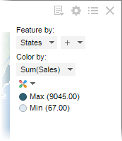
 , and select