Creating a bar chart
In a bar chart, you can compare values for different categories in your data.
There are two types of axes in the bar chart, a
Category axis and a
Value axis. In most cases, columns containing numerical data are selected on the
Value axis, and columns with categories are selected on the
Category axis.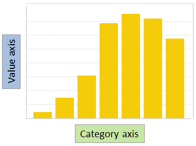
The heights of the bars represent a certain aggregated value for each of the categories. An aggregated value could be, for example, a sum or an average.
Procedure
-
In the toolbar, click
Add new visualization,
 , and select
Bar Chart.
A suggestion of a bar chart is presented.
, and select
Bar Chart.
A suggestion of a bar chart is presented.
Examples
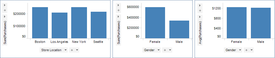
The lefthand and middle bar chart show the total sum of purchases but split into different categories on the Category axis. In the rightmost bar chart another aggregation value, average, is set.
See also Creating a stacked bar chart and Creating a side-by-side bar chart.