Creating a histogram
In a histogram, you can show the distribution of numerical data. The entire range of the numerical values is divided into equal intervals on the Category axis, and for each interval, it is indicated on the Value axis how many individual data values that fall within it.
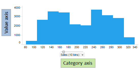
The histogram above is based on a bar chart. It shows how sales figures are distributed between the lowest and the highest amount. Usually there are gaps between the bars in a bar chart. In a histogram though, the bars are placed next to each other to better visualize the distribution of the numerical values along the range. Each interval of the range, also known as a bin, makes a category that is represented by a bar, and the height of a bar shows the number of data values in that particular interval.
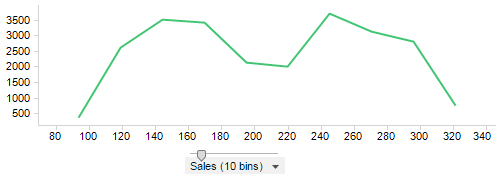
Line charts can also be set up as histograms. The line chart below is based on the same data as the bar chart above. Each vertex on the line reflects the number of data values within the bin in question.
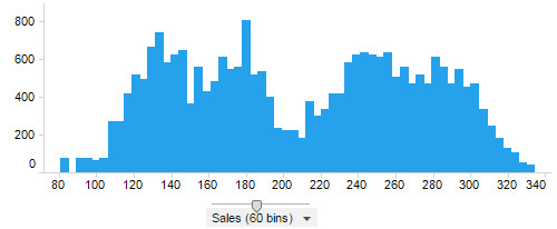
The number of bins can be increased or decreased by dragging the slider on the axis. The histogram below is based on the same data as the other histograms, but the number of bins has been increased from 10 to 60.
The steps below describe how to create a histogram based on a bar chart. A histogram based on a line chart is created in a similar way.
Procedure
-
In the toolbar, click
Add new visualization,
 , and then select
Bar Chart.
A suggestion of a bar chart is presented.
, and then select
Bar Chart.
A suggestion of a bar chart is presented. -
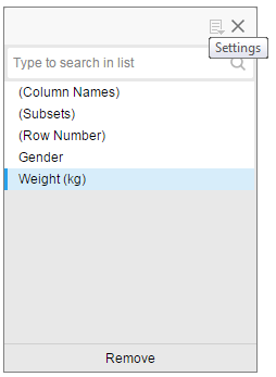
On the
Category axis,
select the numerical data column for which the distribution of the values is of interest.
If the amount of data is big, the range of values on the axis is automatically divided into bins. If no automatic binning is made, do as follows:
 , and then select
Example
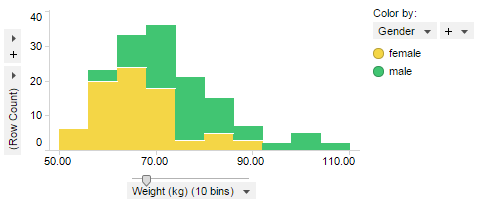
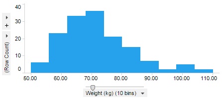
The table lists body weights for 150 men and women. The weights range from 50.0 to 110.0 kg.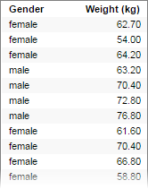
The histogram below displays the distribution of values across 10 bins. Because the entire range is 60 kg, and it is divided into 10 bins, each binned interval comprises 6 kg. That is, the first bar shows the number of people that weighs between 50 and 56 kg, the second bar the number between 56 and 62 kg, and so on.
If you color by gender, you can examine male and female distribution differences as well.